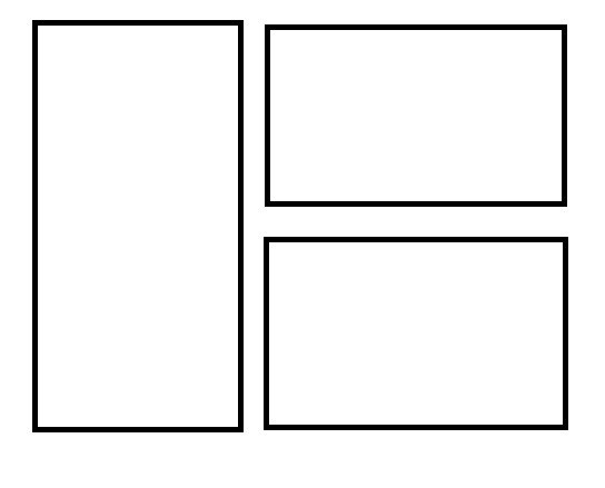
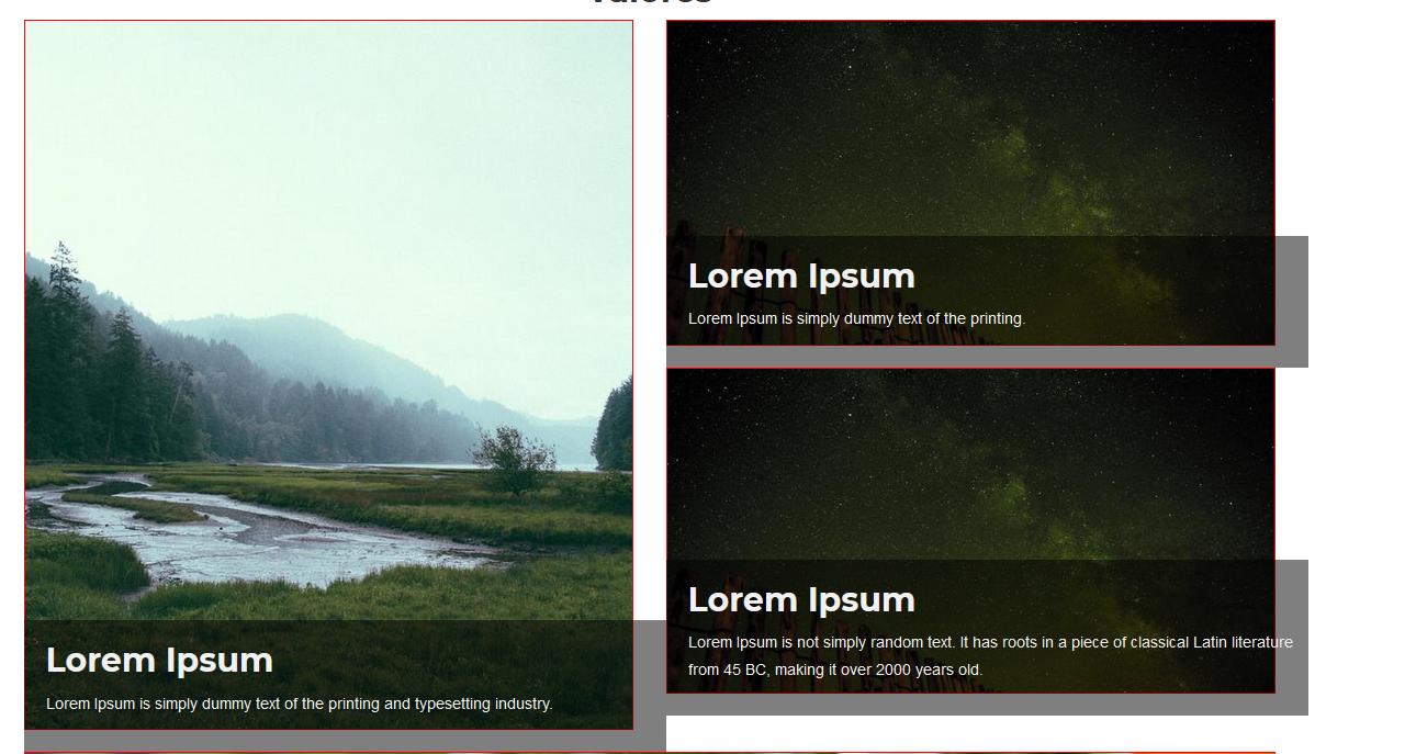
I am trying to create a template like the first image. But part of where the text is is wider than the image, and also the images on the right side would have to distribute them depending on the height of the left image.
the code that I am handling so far.
CSS
figure img{
    margin-bottom:20px;
    border:1px solid red;
}

.content{
    position: absolute;
    bottom: 0;
    background: rgb(0, 0, 0);
    background: rgba(0, 0, 0, 0.5);
    color: #f1f1f1;
    width:100%;
    min-height:120px;
    padding:0px 0px 20px 20px;
}
HTML
<div class="row ">
    <div class="col-md-6 col-xs-12">
        <figure class="">
            <img src="img/nosotros/1.jpg" alt="Valor 1" class="img-responsive ">
        </figure>
        <figcaption class="content">
            <h2 class="val">Lorem Ipsum</h2>
            <p class="desc">Lorem Ipsum is simply dummy text of the printing and typesetting industry.</p>
        </figcaption>
    </div>

    <div class="col-md-6 col-xs-12 ">
        <figure class="">
            <img src="img/nosotros/2.jpg" alt="Valor 2" class="img-responsive center-block">
        </figure>
        <figcaption class="content">
            <h2 class="val">Lorem Ipsum</h2>
            <p class="desc">Lorem Ipsum is simply dummy text of the printing.</p>
        </figcaption>
    </div>

    <div class="col-md-6 col-xs-12 ">
        <figure class="">
            <img src="img/nosotros/2.jpg" alt="Valor 3" class="img-responsive center-block">
        </figure>
        <figcaption class="content">
            <h2 class="val">Lorem Ipsum</h2>
            <p class="desc">Lorem Ipsum is not simply random text. It has roots in a piece of classical Latin literature from 45 BC, making it over 2000 years old.</p>
        </figcaption>
    </div>
</div>
Any suggestion to fix my detail? I use botstrap 3.3.7
I have worked your code and I have found several details.
First of all, figcaption can't have a parent div, I've never used it, so I searched the documentation and it appears that the way to do it should be like this:
In other news, there are many ways to solve this situation, I share two examples in the link to inspire you.
Demo: Inspiring cards - bootstrap 3 by Mariyselita
I hope I have been helpful.
Greetings.
The problem that there was in your code was some absolute positions and one
paddingthat was pushing the elements in an unwanted way. I have made some adjustments to your code that I hope you will find useful. Basically if you have controlled the sizes of the background images it should work without any problem, I have put a colorbackgroundso that you can see what I have changed. Another way to pass the images and control their dimensions is precisely to pass them asbackground-image:cover; background-repeat:no-repeat; you can try that too.